Challenge
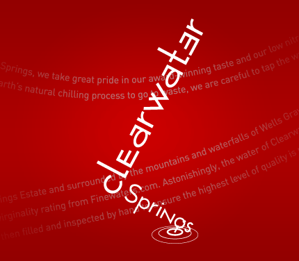
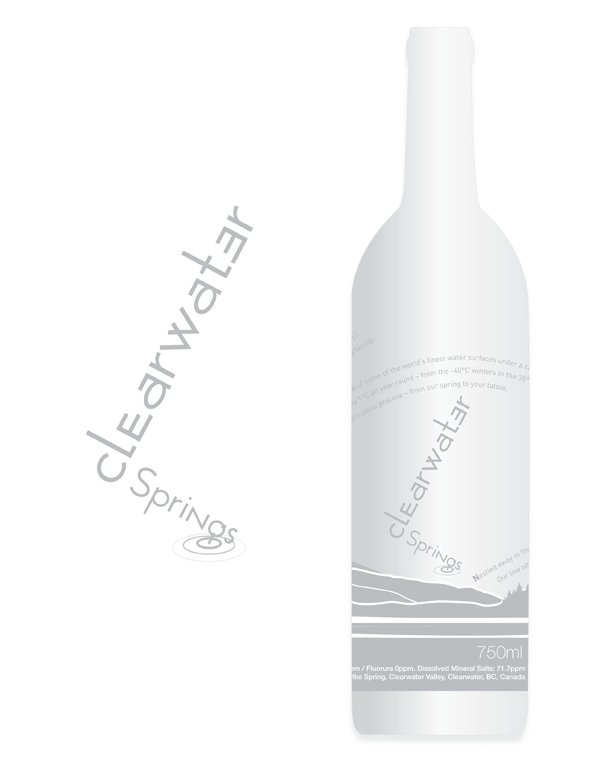
Red Label Vancouver was approached to create and design an evocative logo, business cards, and the actual bottle design for Clearwater’s new premium water. The logo and designs needed to be targeted towards an affluent demographic — with rich tastes.
Solution
Red Label Vancouver created clean, innovative designs that showcase the high-quality of the Clearwater product. The logo and image of the lake on the bottle suggests quality and purity and is an illustration of the company’s actual property (based on a still image).Red Label Vancouver also helped confirm the legal bottle information and sizing through our food industry contacts. The cards and bottle use some high-end design effects to achieve the desired look, including a metallic ink used to reflect the company’s official silver color. The bottle combines frosted glass with a metallic ceramic paint to achieve its stunning effect. Additionally, the label uses an innovative storytelling technique that highlights the company’s values while telling an engaging story. The text on the label literally ‘flows’ around the bottle as the story unfolds.
Results
Clearwater received unprecedented attention for the Red Label Vancouver logo and bottle design and we continue to provide them with expert design advice.