
Challenge
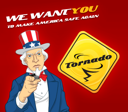
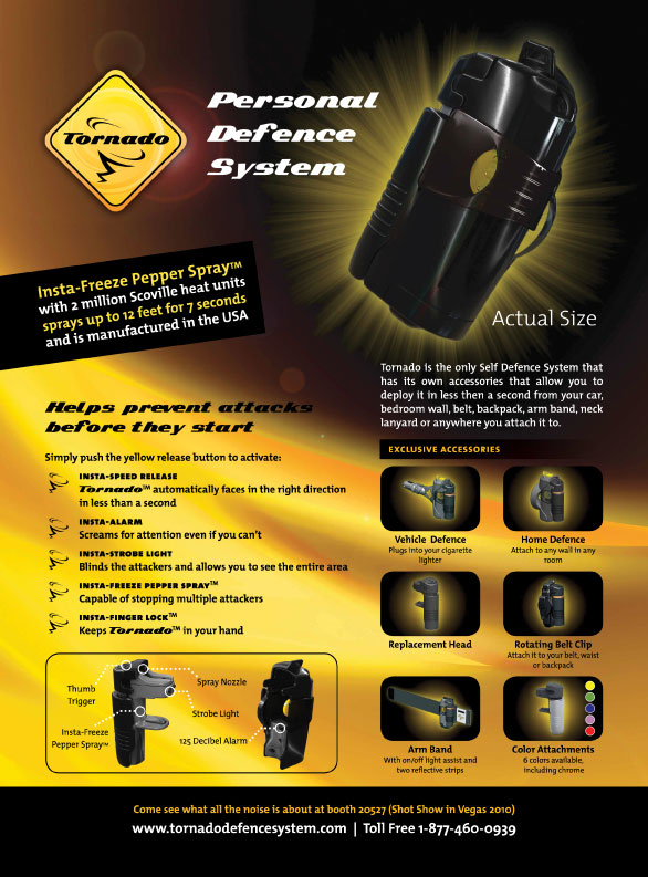
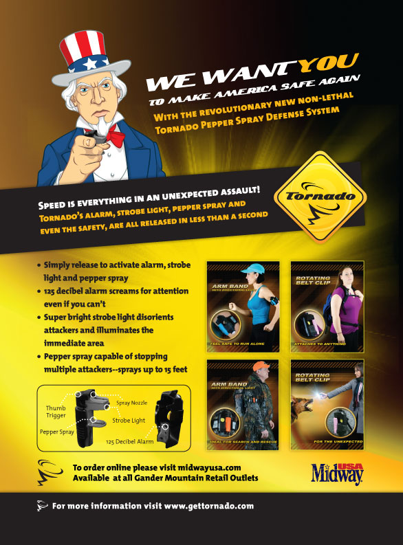
Red Label Vancouver was approached to create and design marketing collateral for Tornado’s personal self-defense products. The company wanted dynamic graphic designs that would capture and hold a US audience’s attention, while still falling within established brand and style guidelines.
Solution
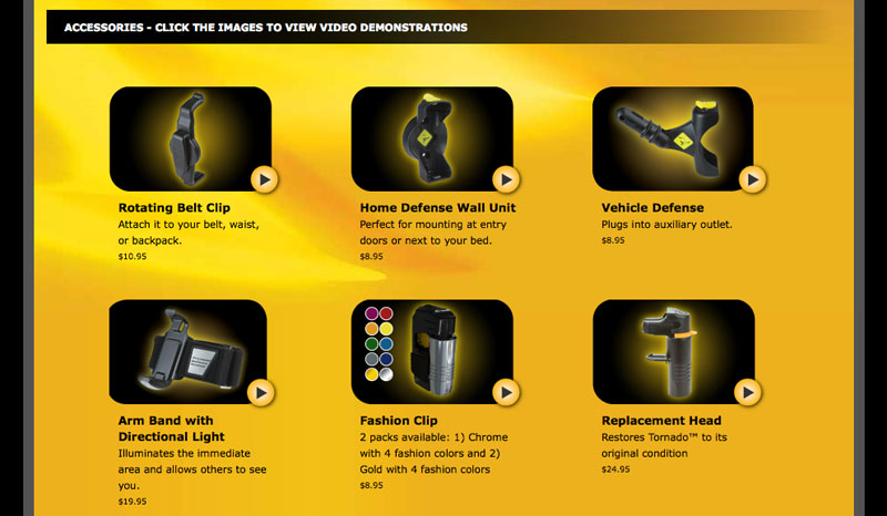
Red Label Vancouver designed and created a bold, colorful package with shelf presence. They wanted the brightest colour possible to catch attention on the shelves. They brought us an idea, with which we designed a logo and package design with the same spirit. Red Label Vancouver chose a yellow, orange, and black color brand palette that ensured that the new packaging would stand out from the crowd. They loved the designs — and soon we were creating the packaging design for all six Tornado accessories with a consistent framework. We also designed and programmed an ecommerce website to help sell the Tornado products on the web. We’ve done print marketing graphic design for Tornado as well: creating the instructions manual, designing advertisements for magazines, designing a tradeshow booth, as well as designing flyers and various sales and marketing tools.
Result
Tornado’s new packaging design is bold and brilliant and makes an immediate impression on the viewer. Tornado was extremely pleased with the final design results and continues to rely on Red Label Vancouver for creative and graphic design expertise.