
Challenge
Red Label Vancouver was approached by the Small Explorers and Producers Association of Canada (SEPAC) to create and design a new look and feel for their marketing collateral. SEPAC wanted to launch the newly branded look at the SEPAC Oil & Gas Investor Showcase, a large industry convention. The launch would include poster design, trade show display design, and various printed material designs.
Solution
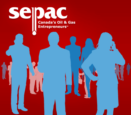
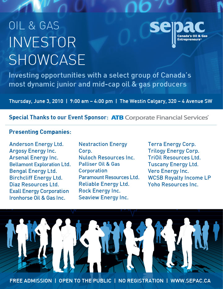
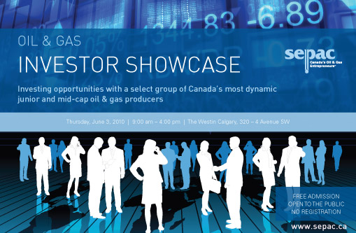
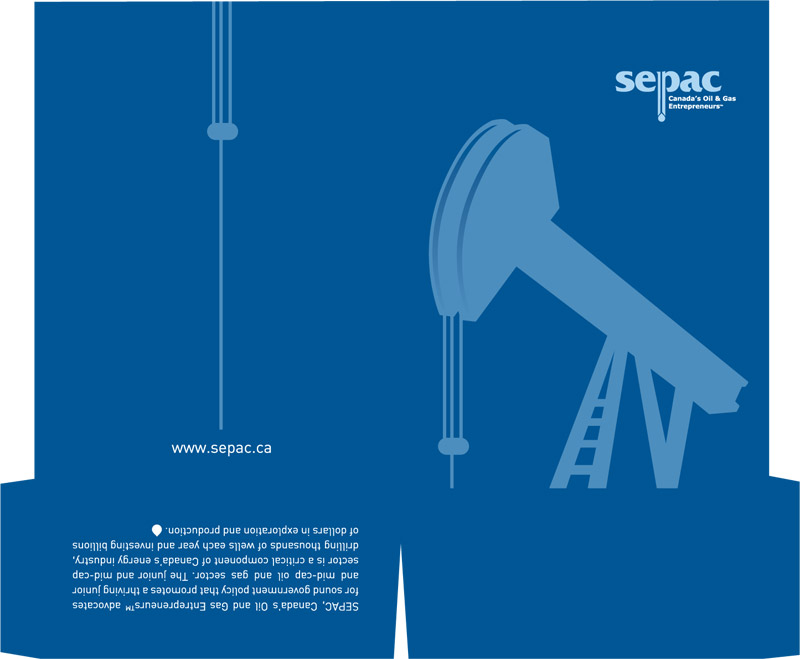
Red Label Vancouver designed a modern, updated look and feel for SEPAC that wowed everyone at the Oil & Gas Investor Showcase. The major change for SEPAC was a design using a new blue color palette and a recurring pump jack in vector form that is used throughout much of the designs. The new look allowed Red Label Vancouver to design dynamic trade show displays and stunning take-away collateral graphic designs. At the convention, the new overall look and feel were adapted and used consistently for all marketing materials, including design of: magazine ads, the trade show booth, SEPAC booklets, brochures, and more.
Results
SEPAC received unprecedented positive feedback from the convention and continues to get compliments on the design of their new look and feel. Red Label Vancouver has designed numerous pieces of marketing collateral for SEPAC, and we continue to provide them with online and print graphic design expertise.