Challenge
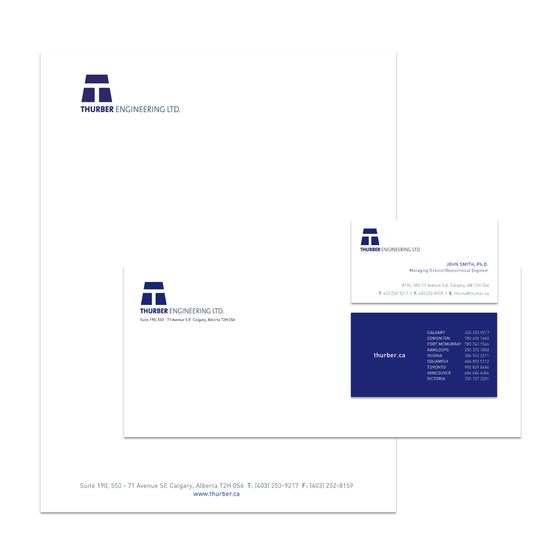
Red Label Vancouver was approached to design an updated version of logo and a new style guide for Thurber Engineering. The company wanted an updated logo and brand that would remain recognizable within their marketplace. Ideally, the new logo design would support the company’s established history, brand, stability, and reflect their commitment to integrity. Additionally, the company needed to design a single document that would establish their brand and logo style guidelines.
Solution
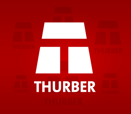
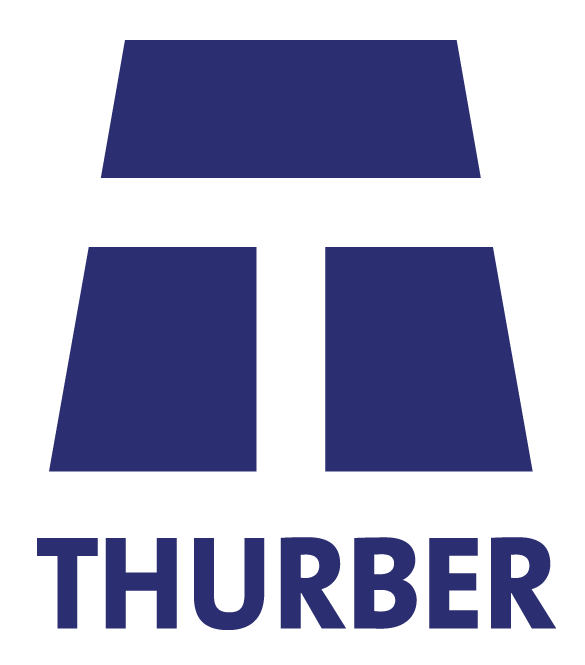
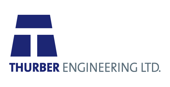
Red Label Vancouver took the design of Thurber’s original logo and gave it a simple but effective facelift. The new design focused on refining the color brand palette and updating the company logo font to better reflect their ideals. The logo's T bar design is redefined to become taller and stronger. This strength and stability suggests the idea of reinforcement — one of Thurber’s main areas of expertise. Additionally, Red Label Vancouver created a detailed brand, design and style guide to establish the rules governing use of the company logo and any other company branded imagery.
Result
Thurber was extremely pleased with the final results of the logo design and continues to use the brand and style guide. Red Label Vancouver maintains a strong and active relationship with Thurber and continues to provide them with creative and design expertise.